
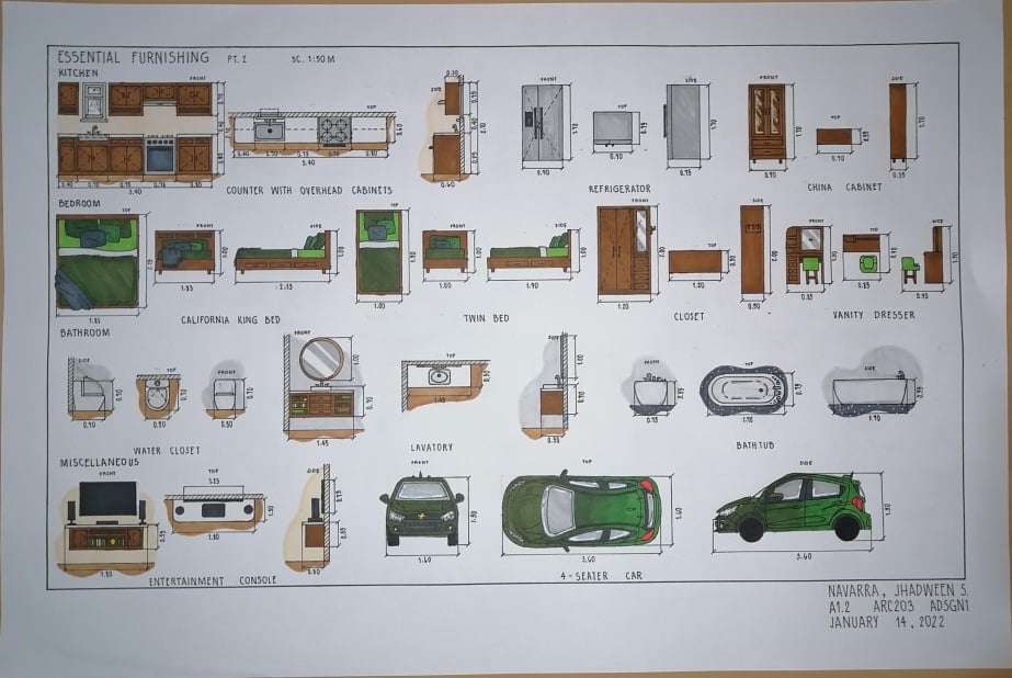
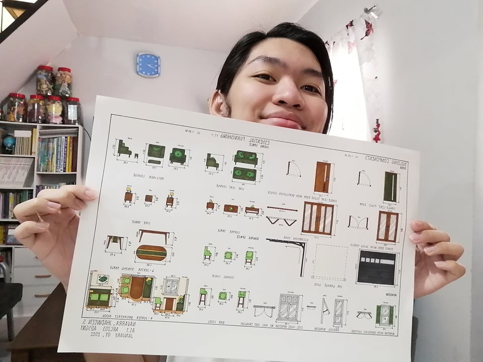
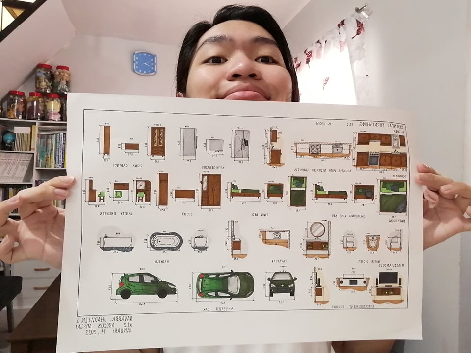
This is my first activity plate in the subject Architectural Design 1, wherein we were tasked to draw, design, as well as scale some of the different components and furniture needed in a home. For my design, I kept in mind the whole structure and their placing in each room if it were in a real home. I also wanted to make it simple but also modern and chic, while also keeping in mind the concept of comfort. With that in mind, I design the chairs to have soft cushions and even with pillows for more comfort. Additionally, I chose earthy and nature-toned colors to make it eye-pleasing not flashing or an eyesore. I gravitated more on the colors deep olive green and rose beige as my bases, then used other tones to create balance and some contrast. Likewise, to balance it out since the two colors are dark, I used a cream color for my flooring and peach for my wall to keep the ambiance clean and well lit. Similarly, I used white countertops on my kitchen and on other surface of furniture to balance the dark color of rose beige. I also used different tones of greys to have a neutral side and make it as though it is very calm and not as flashy as I’ve said. Yet again, this was a fun activity to work with and I enjoyed generating ideas for my design. See you again as I build, an arki. Byeee!
