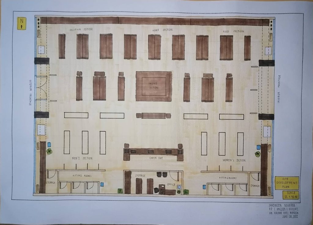
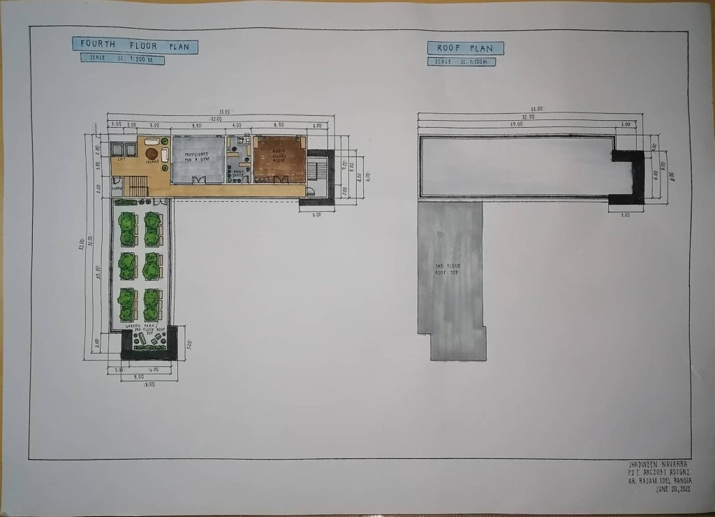
This is my final plate in the subject Architectural Design 2, wherein we were tasked to design a new branch for a store called Kultura know for its locally made products. With this in mind I designed this Kultura shop like this to showcase each of their products by designating their own sections. They were also placed based on which products will attract more customers. It was also designed to be spacious for better viewing and shopping experience. As for its shelves, it was designed to have more capacity, but storages were provided for storing other products. The facade’s design was altered from the typical design to give it a more elegant approach although keeping its wood texture. It was very challenging work for me. However, it is yet another step in building an arki. ’til next time, byee.
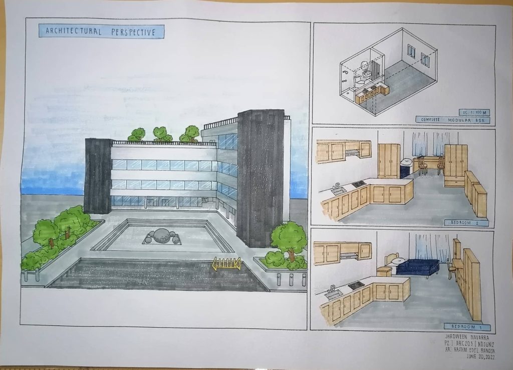
This is my second major plate in the subject Architectural Design 2, wherein we were tasked present the most ingenious design for a mixed- use architectural facility which can be host especially for the purposes of student housing for National University- Baliwag. As well as propose a way of rethinking multifunctionality in space design, while being challenged by many possibilities and factors which can affect changes in relation to user types, integrated functions, and even various socioeconomic conditions. With that in mind, I designed this building to be used as a mixed-use building, wherein the ground floor is for commercial space utilized for public use. While the upper floors is for residential space for intended users such as NU students. These commercial spaces include a internet cafe, coffee shop, laundromat, book store, and a convenience store, chosen based on intended users of the private space. Amenities are added including a gym and an AVR in consideration of intended users. This building will be utilizing a modular type of construction like the PPVC system where as each rooms will be constructed individually as complete modular boxes.
I also used the following design philosophy:
“Simplicity is not the absence of clutter, that’s a consequence of simplicity. Simplicity is somehow essentially describing the purpose and place of an object and product.” by Jonathan Ive
In line with this design philosophy, the overall design of the building is intended to be simple to focus on functions and intended use of it. However, through well thought-out details and careful planning, a simple yet good design can be achieved bringing simplicity and clarity in the design.
This was very difficult yet fun to work on, and another step towards building an arki. ’til next time, byee.
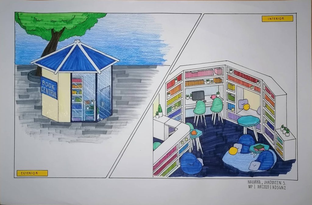
This is my midterm plate for the subject Architectural Design 2, where in we were tasked to design a book sharing facility or reading nook that will be placed or situated in Glorietta de Baliwag. I placed it in the center of the site to serve as source of knowledge, from history of Baliuag to other relevant topics. It was octagon-shaped so it can cater to each direction since the site is circular. Additionally, the windows were placed to avoid direct sunlight but also face entry points. As for materials used, acoustic glass were used for windows to block out noise since it is a public setting. While, EPDM membrane is used for the roof to ensure that it can withstand extreme weather. I also provided enough and comfortable seating to accommodate people. A TV and a desktop is also placed for quick access of digital information, but books are the primary source placed in the area. While for the colors, I used cool tones so it would be soothing to the eyes and since the color of Baliuag is blue. It was really fun and exciting to work on this plate. Although I encountered problems, still, it was a leearning experience for me as I build an Arki. ’til next time, byee.
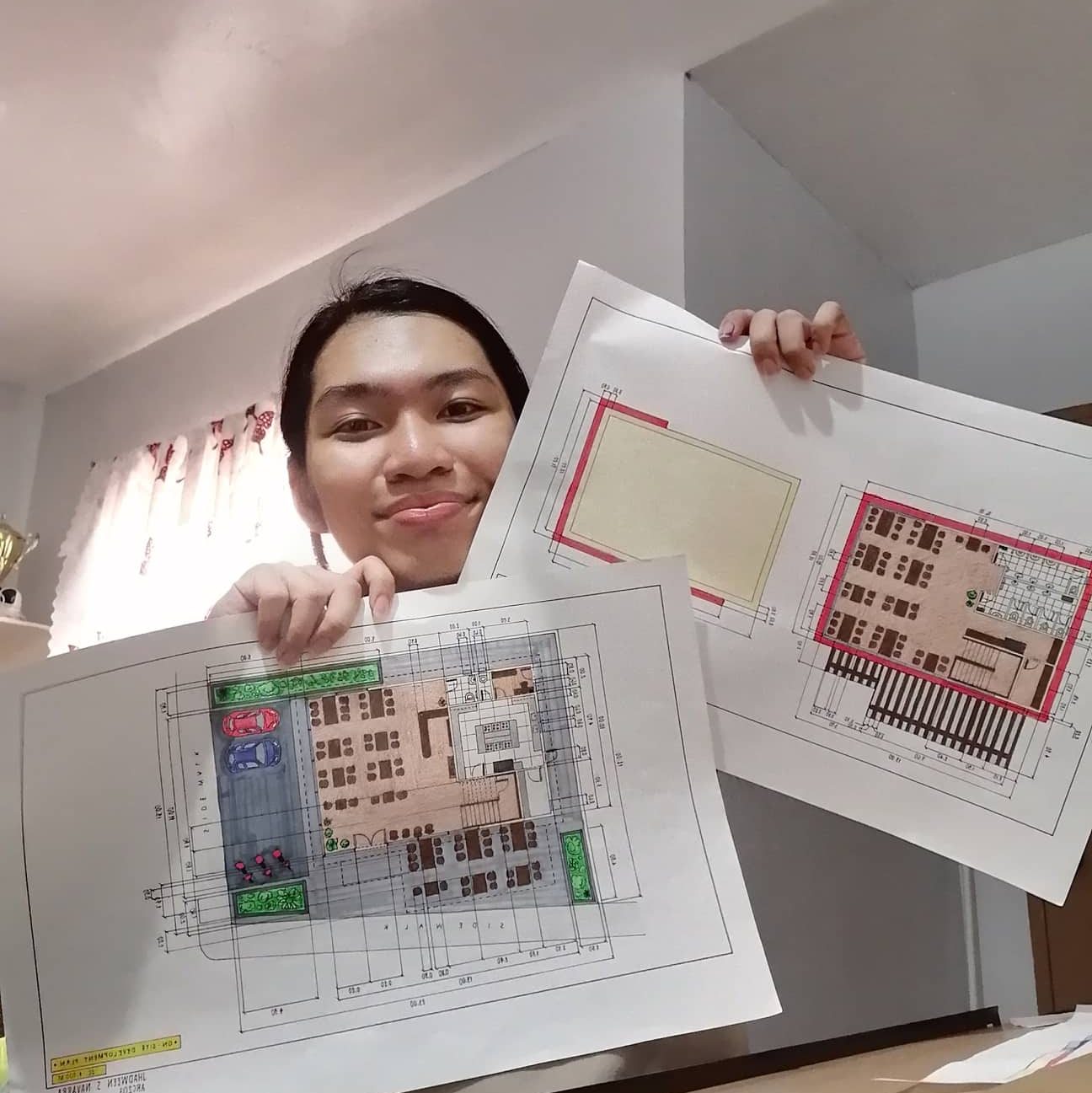
This is my first major plate in the subject Architectural Design 2, wherein we were tasked to design classic Chinese restaurant. Lan Zhou La Mien is the Chinese restaurant assigned to me that I have to design. This restaurant is known for their hand-made noodles, simple seating, and simple design. So, I kept that in mind when I designed a new building for them. Then, I incorporated some elements to keep it a bit more modern and more classier. With that, I made sure to include simple type of seats. Also, I provided restrooms for people who are physically challenged and for both genders to accommodate for the customers’ needs. I also provided restroom for the employees to cater to them as well. For the kitchen, I provided a lot of counterspace since Lan Zhou La mien are known for their handmade noodles, so that is what it’s for. I also utilized the under stairs as a storage and/or as a janitor’s closet. I also provided enough parking space for customers with private vehicles. As for the colors, I used the same earthy tones with their previous and other store branches, which are browns. Then, I added the color red to add a pop of color and because red is essential in the Chinese culture. It was really hard activity but it was also a really a learning process for me as I build an arki. That’s all, ’til next time, byee.
This is my second major plate in the subject Architectural Design 1, where in we were tasked to to create a design for the most ideal dwelling for a typical Bulakenyo family, a resilient abode that shelters a family from the threats of disasters, as a way of demonstrating sensitivity to the context. It is entitled “Cube a la mode”, which translates to trendy cube. It is because it is inspired by Cubic architecture. Additionally, this house is my take on modernized and transformed “Bahay Kubo” that is designed to withstand heat as well as occasions of typhoon, and flooding. It is because the Filipino term “Bahay Kubo” literally means “cube house”, describing the common shape of the dwelling. Also, “Bahay Kubo” is common not only in Bulacan, but also throughout the whole country. Hence, This is my take on redefining the Bulacan abode. It was a bi difficult but a fun project in the long run. I hope i improve more as I build an arki. ’til next time, byee.
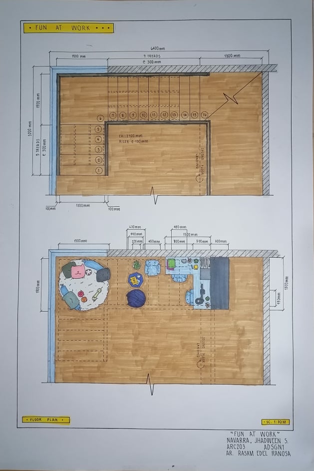
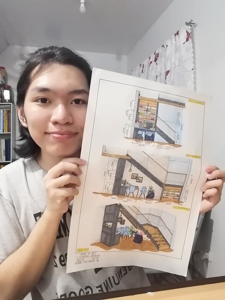
This is my second activity for the second term in my subject Architectural Design 1, wherein we were tasked to design the under the stairs and make it functional. My work is entitled “Fun at work” because in my design, the area under the stairs serves as a workplace but it can also be a lounge area. I designed it to be a workplace since during the pandemic, online classes are being practiced. So, it will be a place for the children for their online schooling. Similarly, it can also be a place for work from home for the adults in the family. Thus, it will serve as an office at home. That is why I placed a corner desk with chairs and a desktop. While it is also designed as a lounge area wherein you can read a book, play online games, or simply relax. So, I put another chair and a bean bag for lounging. In line with that, I wanted to maximize and utilize the stairs. So, I made the steps of the stairs to have shelving under each step so that you can store books, ornaments, shoes, and others. On the first five steps, it will serve as a shoe rack to utilize the space, while the rest of the steps, which are higher, are shelving books and ornaments. Additionally, I added stair lights underneath the steps, and I placed it there so that it can serve as a stair lights and sources of light for the under-stair area. As for under the split landing of the stairs, since it is low for human access, I made it into a pet area. The pet can sleep and play there. On the other hand, the large cabinet that is serving as wall or divider, it can serve as a pantry since the area is adjacent to a kitchen, or simply storage for utensils, tool, or others. It can also be reworked to fit a refrigerator by redesigning it. So, it will really depend on the user on how they will utilize that cabinet or shelving. Lastly, I always add plants here and there to add some life to my design. As for my color palette, for the structures I colored them neutrals so that the emphasis will be on the under-stairs area. With that, for the furniture I colored them with blue tones and other colorful tones to give it a pop of color. It was a really fun activity and I’m hoping to improve more in the future. This is building an arki, ’til next time, byeee.
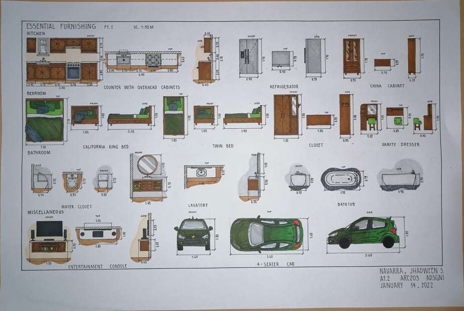
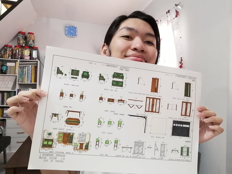
This is my first activity plate in the subject Architectural Design 1, wherein we were tasked to draw, design, as well as scale some of the different components and furniture needed in a home. For my design, I kept in mind the whole structure and their placing in each room if it were in a real home. I also wanted to make it simple but also modern and chic, while also keeping in mind the concept of comfort. With that in mind, I design the chairs to have soft cushions and even with pillows for more comfort. Additionally, I chose earthy and nature-toned colors to make it eye-pleasing not flashing or an eyesore. I gravitated more on the colors deep olive green and rose beige as my bases, then used other tones to create balance and some contrast. Likewise, to balance it out since the two colors are dark, I used a cream color for my flooring and peach for my wall to keep the ambiance clean and well lit. Similarly, I used white countertops on my kitchen and on other surface of furniture to balance the dark color of rose beige. I also used different tones of greys to have a neutral side and make it as though it is very calm and not as flashy as I’ve said. Yet again, this was a fun activity to work with and I enjoyed generating ideas for my design. See you again as I build, an arki. Byeee!
This is my diagnostic plate for the subject Architectural Design for this second semester in BS-Architecture. We were tasked to draw and design a shelter or home for our furry pets. Unfortunately, I don’t have my own pet so I have to just choose one dog or cat. I chose a Bichon Frise because it is very cute, small, and dainty. They are also very playful and friendly. Additionally, they are also hypoallergenic, meaning they are less likely to cause or trigger allergies since they don’t shed, instead their fur grows that’s why they are needed to be groomed properly. Which is also good for me since I have allergies and I easily sneeze and catch cold because of shedding pets. As for the design of the house, I wanted to keep it cute but also functional and ergonomically correct by providing accurate sizes made specifically for the Bichon Frise and also to give enough room for the dog to sleep, eat and drink, as well as play. Likewise, I chose the colors white, blue, and a hint of yellow for the comfort and benefit of the dog. It is because blue and yellow are the colors what dogs mostly see compared to other color, specially blue, plus it keeps the temperature of the house balanced because the color blue is not that bright but also not that dark so it can absorb heat but not that much unlike black. Lastly, I put two, small windows on the side to have some sort of ventilation in the dog house. This was fun project to work and I really enjoyed doing it. I hope I can get my very own Bichon Frise so I can have a pal in my journey as I build an arki. That’s all, ’til next time, byeee.
This is my 7th plate in the subject Visual Techniques 1, wherein we where asked to draw a glass structure or building using pen & ink, and gray markers. Additionally, we were asked to put an entourage on the building to show ow the building would look like if it is inhabited by people. I chose this building to draw because it was very modern and I like modern structures. Similarly, this building is geometric and asymmetrical at the same time. With that, I also chose this because I like any symmetry and asymmetry in any structure because for me it creates a visual pleasure. Also, for me this feature makes it perfectly imperfectly. This was yet another fun work for me. Also, with this, I was able to practice using the gray markers and blend them more well compared to my plate 6. Unfortunately, my cool gray 1 run out of ink so the buildings on the right and left side were lightly colored. Along with all of that, this was a great experience as I build an arki. ’til next time, byeee.
This is my 6th plate in the subject Visual Techniques 1, wherein we were tasked to select a particular place in our own homes and transform that place by changing its interior design. In this drawing, I made sure that the furniture are elevated or have some space below them, because my mom loves cleaning. When she’s cleaning, she wants to be able to reach every nook and cranny so they will be thoroughly cleaned. Similarly, I added bean bags, pillows, and a soft, furry carpet for the reason that I love soft things and these things are very comfortable.I also based the design on some modern styles cos’ I want it to look cool and relaxed but also chic and stylish at the same time. This was a fun and enjoyable experience since it’s my first time to use alcohol-based markers. With that, you can see how inexperienced I was in using these markers by the visible stokes on my work. Hopefully, I would be able to master them in the near future. Lastly, it was yet another lesson in building an arki. ’til next time, byeee.